
Limelight coaching therapy – trusting the rebranding process
Background
Coaching therapist Karen Boldy founded her business, Limelight, in Dubai in 2019, moving to Yorkshire in 2021. Karen takes a therapeutic and holistic approach to coaching, supporting her clients to embed their new ways of thinking and achieve lasting results. She works with business leaders of all levels, as well as elite sportsmen and women who are trying to improve their mindsets to stay on their game.
Challenges
Karen branded her business as Limelight because she wanted her clients to put themselves at centre stage where they could shine. Her original logo reflected this idea, featuring images of lights in lime green, highlighting an ‘off-centre’ me’. Karen loved her logo but also recognised that it needed modernising to reflect her new and fresh approach to leadership coaching.
Solutions
Karen already knew about Get Ahead through business networking. She approached us for support with the rebranding process and we introduced her to Kate, one of our most experienced graphic designers.
Kate began by talking to Karen and finding out about her business. Kate recognised the conflict in Karen about the brand – Karen loved her existing logo, but also knew she needed to update it. Kate understands that changing the logo feels like a very big deal to any business owner and completely sympathised with Karen’s position. Fortunately, the two women established a connection and business owner Karen felt able to put her trust in graphic designer Kate.
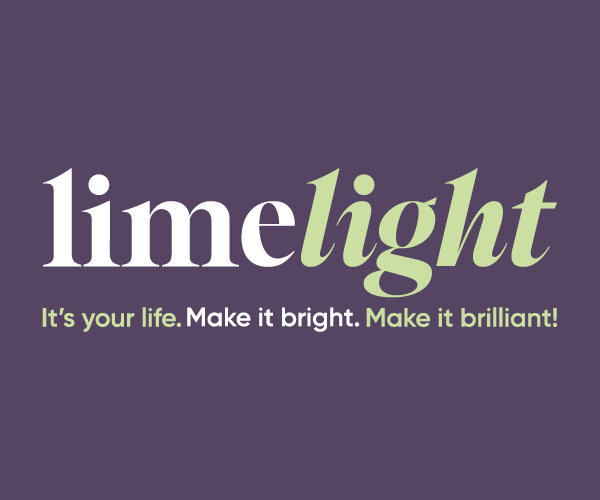
Kate began by doing some sketches, recording all her ideas visually. She felt that a simple design would be the most effective – there was no need to overcomplicate it. She ended up with a design created around the word “Limelight,” after picking up from Karen’s testimonials that the idea of “light” was important to her clients. She had found a suitable font to use as a starting point, then set about adapting it to create the strong design Karen’s business deserved. At this stage, she was using strong shades of lime and magenta, trying to reflect Karen’s drive and energy.
When Kate showed her the new design, Karen liked the idea but felt the colours were wrong. Instead, she showed Kate shades of purple and green that she had been experimenting with herself. Karen particularly wanted to use purple for its tranquil properties. Thanks to the trust they had built, Kate fully embraced Karen’s colour idea for the design. Now the completed logo is Kate’s design in Karen’s colours.
Outcomes
Karen was initially surprised that the new logo was such a departure from the old one. However, she quickly came to love the message and story it tells.
She has had new business cards printed, featuring the new logo. She took the opportunity to get rid of an obsolete phone number and improve the quality of her cards. The new cards are designed to appeal to both the senses of sight and touch, reflecting Karen’s expertise as a therapist. Now she feels even more confident giving her cards out – confidence which others pick up on.
The new branding really makes me smile…I love it. I really enjoyed working with Kate – I hadn’t expected her to create the design she did, but when I saw what she had come up with, I knew it was right for me and my business.
Karen Boldy, Founder, Limelight